
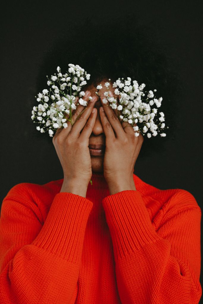
Colour tones are one of the easiest ways to edit photographs. You no longer have to worry about colour correction if you are adding a cast to the overall image, and you can also use subtle touches to introduce a new mood. Whether you go for a delicate flash, as with some of the Colorosity Lights Action Collection, or you change the seasons as with the Colorfall Action Collection, you can make a big impact. Here are all of the colours of the rainbow that you can add to your photographs, and what they mean for the mood.
Red
If you want to add warmth and passion to an image, then red is a great choice. It is strongly associated with love and especially with Valentine’s Day. You can also use it to raise the temperature of a photograph – especially one taken indoors. It can look hot and steamy if you use the right touch. If you go all the way up to bright red for a highlight or flash of colour, it can evoke thoughts of danger. You can play with this to create a very dramatic image.
Orange
This tone is also very warming, and can make the image seem like it was taken during the golden hour if you keep the colour subtle. It’s a colour that evokes thoughts of fall, but can also create that warm summer feeling depending on how it is used. It’s a more enthusiastic and fun colour than red and can create the impression of a happy situation. It’s great for portraits where the subject is smiling.
Yellow
Be very careful about how you use yellow, as applying too much as an overlay can cause the subject to look washed-out or ill. It is also the kind of colour that doesn’t look great when it is too bright. Keep it to the background where possible and mask off your model. You can use it to brighten an image and make it look more summery, but too much of a heavy hand will simply leave it looking odd to the human eye. Yellow can even cause tiredness and irritation if you stare at it for too long, according to some studies, so don’t make it too prominent.
Green
Adding green to a photograph can help it to feel calmer and more tranquil. It’s a natural colour and this can help to add vibrancy as well. If you want to make yellow work better, try pairing it with green – as these colours have the opposite effects, they can cancel one another out. Outdoor photographs can benefit from a splash of green, which can transform a cold day into spring sunshine. It can also feel very nature-friendly.
Blue
You probably know that blue is associated with calmness, which makes this a good colour for toning down images that are a little too busy. It can also edge over into sadness, so look at the tones that you are choosing if you want to really emphasise the poignancy of an image. Deep, dark blue can also create a sense of mystery and even mysticism in an image. It’s quite a powerful colour and is often used to convey corporate messages, so it will function well for more official uses. A sunny day can be turned cold and even wintery with use of blue tones over the background. Your model can also become cold, unfeeling, or sad when you apply the colour over the whole image.
Black
Black will always darken your image dramatically, so this is something that you have to consider carefully. It’s not generally a good choice unless the image was overexposed in the first place. It will dominate the image and may even distract the viewer from the subject. It makes for a good choice if you want spooky images, however, such as for Halloween specials. It can also close the image in and make it feel more claustrophobic, especially if used as a vignette.
White
White is the opposite of black, and will help to open the image up. You can make it brighter and even create a sense of space in the photograph. Go too far, though, and you will end up with a misty look to your photograph, which may even convince the viewer that you got the exposure wrong. White requires a light touch and is often best used in combination with other photographs.
Pink
Pink is a colour of youth, of romance, and of the flush of spring. It helps the image to warm up and can even make the subject appear more likeable. It’s a great option for senior portraits as it can bring a young and playful vibe to the photographs. In couples shoots, you will find that a dash of pink evokes feelings of love. Of course, when shooting a female subject, it can also give that overall girly and feminine look!
Combinations
It’s a really good idea to think about combinations of colours and how they can play off against one another. For example, red is the colour of danger, while blue is calming. You might think that they would cancel each other out, but then there’s another angle to think about. In many cultures, red and blue are used for the lights of the emergency services. Therefore, these colours together can evoke a sense of danger or emergency. They can also evoke a street vibe, depending on how they are used.
It’s also worth considering your colour tones as a way to correct poor lighting. When in a yellow or orange light, you can add a blue or green colour tone to bring it back towards a normal look. This is just the same as trying to adjust your colour balance, but it may give you stronger results.
How do you use colour tones? If you have never tried them before, give it a go – we’d love to see you show off the results in the comments!