THIS IS A GUEST POST COURTESY OF MELISSA COLLINS OF MJCOLLINS PHOTOGRAPHY
Composition is more than just setting your subject in front of a pretty brick wall; composition is seeing symmetry, frames, negative space, etc. in your lens to create interesting and appealing photos! Understanding composition is the difference between a picture and a photograph!
“Ok. Stand there by that tree and say ‘cheese!’”
*Click*
You probably just took a really nice picture! However, if you are in the market for creating a photograph, you could take that same picture and with a little thought and purpose, make art through the use of the composition. A good composition is a key aspect of an art piece, and it can make a masterpiece out of the dullest object, subject or environment. Composing an image means arranging elements in a way that suits the story or goal that is visually pleasing. (Or break the rules! No one has ever said an image has to have a pleasing aesthetic!) In portrait and still life photography, it is simple to arrange your subject or object. Landscape and street photography involves anticipation since the photographer sometimes has no choice but to move or wait for a suitable moment.
Focal length, aperture, camera positioning, and subject placement all contribute to your overall composition, which is why some planning ahead of time is your first and most important step of making a remarkable photograph. Once you learn the art of composition, you begin to see and use the elements of your environment to your advantage like colors, shapes, tones, shadows, and light to strengthen the composition!
There are more than 10 ways to compose a scene, but when I start getting into geometry and measurements, my head begins to ache! Here are some examples to get you on the road to interesting imagery starting with the easiest and most common one:
RULE OF THIRDS:
You divide the frame into 9 equal rectangles: 3 across and 3 down. The idea is to place important elements along one or more of the lines, or at a line of intersecting.
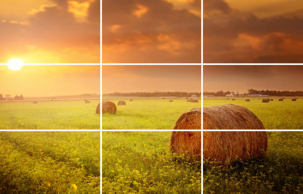
We have a natural tendency to put our subjects right in the middle of the frame, but placing the image elements and subjects off center using the rule of thirds will allow our eyes to scan the details of the image and more often than not, lead to an attractive composition.
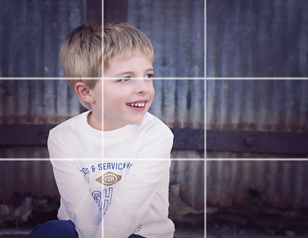
CENTER AND SYMMETRY:
Now that I’ve just told you not to place your subject in the middle of the frame, here are some fine examples of doing the exact opposite! There are times when placing your subject in the middle works really well!
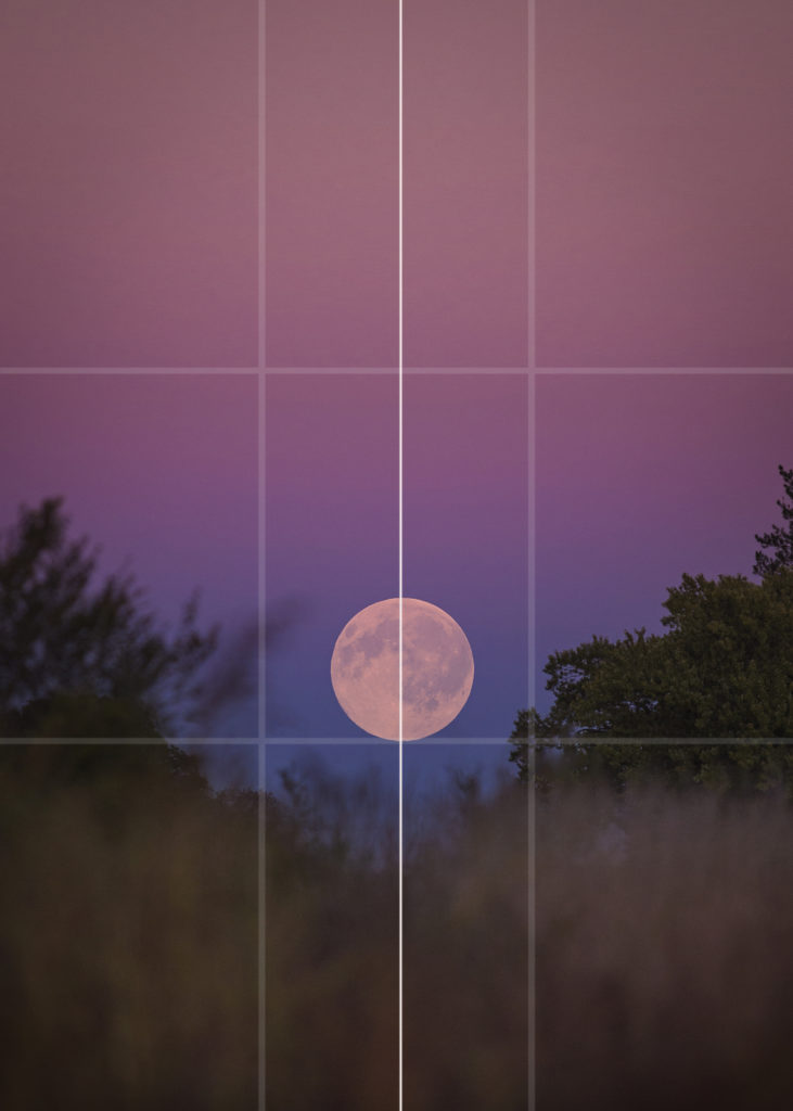
Symmetrical and architectural scenes are perfect for the centered and symmetry composing technique.
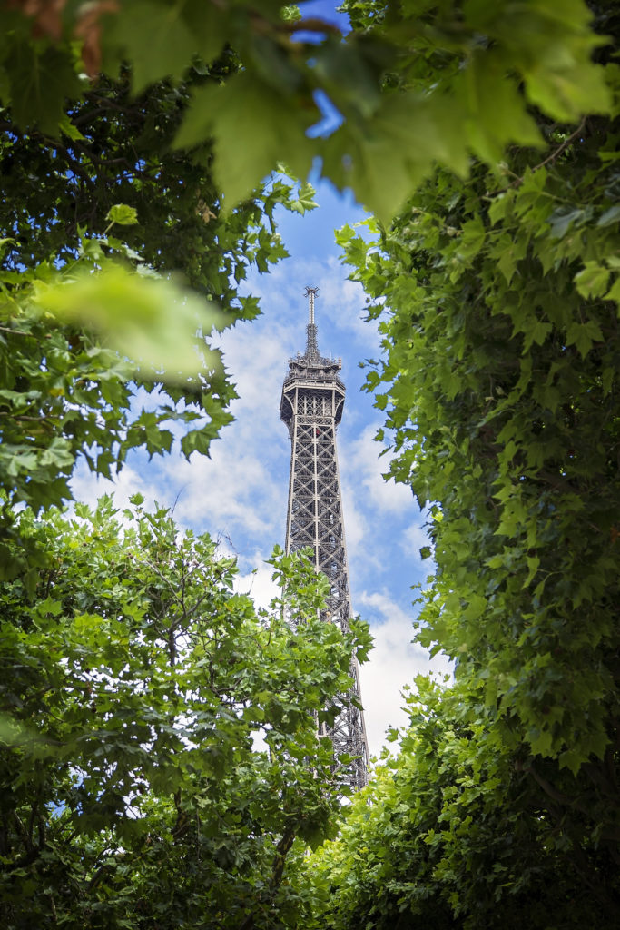
FRAME IT:
Including a frame around your subject or element is another excellent way to portray depth in a scene. Look for archways, doors and windows, trees & shrubs, overhanging branches, or walls to frame the scene.

The “frame” doesn’t necessarily need to surround the entire scene to be effective.
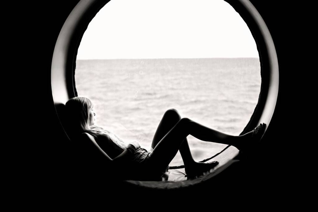
NEGATIVE SPACE AND SIMPLICITY:
Using negative space creates simplicity and uncluttered minimalism.

It leads the viewer’s eye straight to the subject. Less is sometimes more!

Simplicity itself is a powerful tool and it means taking photos with uncomplicated backgrounds.
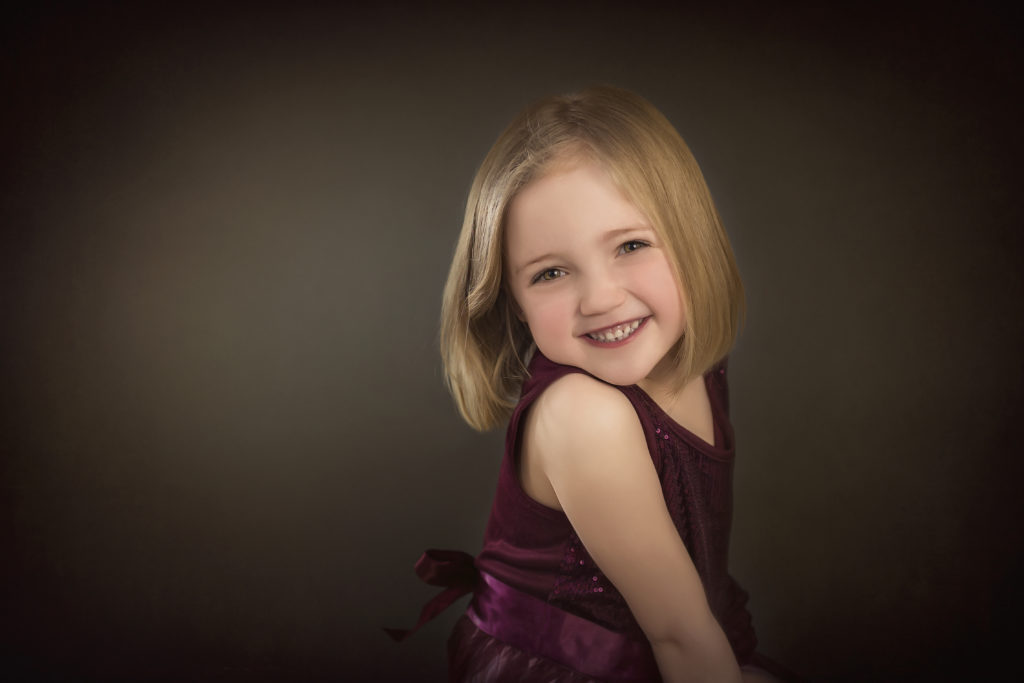
CHANGE THE POINT OF VIEW:
Most photos are taken at eye level. Getting up high and down low creates a more interesting image of a familiar subject.


LEADING LINES:
Leading lines help guide the viewer through the image to focus on important elements. Anything from paths, walls, lines, and patterns can be a leading line.

By now, I hope you are “seeing” the different compositional elements in the images and realizing that you can combine several together to create an interesting photograph!
Now it’s your turn! Play with colors, shapes, and your camera settings and watch your creativity emerge! Also, a good exercise is to study your favorite images and try to figure out what composition the photographer had in mind when they clicked the shutter.
This article was featured in Summerana Magazine | May 2019 | The Floral Issue. See the full issue here.