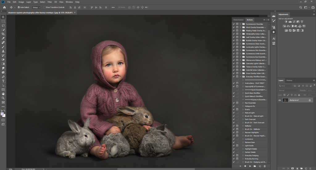
When you look at your Photoshop workspace – the area that you can see while you are working – you probably see something very similar to the vast majority of Photoshop users. The program comes set up a certain way, with panels to both sides and a menu bar at the top, and specific buttons and tools are included in those panels. What does this mean for you?
It means that the way in which you use Photoshop may not be the optimum way, for workflow, convenience, or speed. If you haven’t customized your workspace, you seriously should! The way in which you work is unique, and you will need access to certain tools most often – while perhaps never using others. Getting your workspace set up right means moving a lot of things around, but once it’s done, it will help you immensely with getting things done right.

Pre-set Workspaces
Adobe include a number of workspace options which are already set up for you, with different options included. These are:
- Essentials
- 3D
- Graphics and Web
- Motion
- Painting
- Photography
As a retoucher working on photographic images, you would imagine that “essentials” and “photography” are the best for you. But really, both of them include tools you might not need – and miss out some that you might use every day. First of all, let’s figure out how to switch between workspaces.
At the top menu you will see an option marked with the name of your current workspace. Click here to bring up a drop down menu. You can play around with this to see which suits you best as a base set-up, and you can save your own choices as a new set when you are done.

Panels
The panels to the left and right of your screen can be moved, changed, and rejigged any way that you like. There are so-called “drop zones” at each edge, and if you have a floating panel, you can simply drag it over to a drop zone until it is highlighted blue. Then let go, and it will dock to that side, anchoring it in place.
You can have whatever you like in these panels. You might want to have your actions easily accessible to the right, for example, as well as common adjustments and the layers tab. Try dragging tabs around: you’ll see that they can dock underneath or above existing tabs, to the side of them, or as a new panel that runs parallel to them. You can put as many tabs in as you want, and can remove any that are already there as well.
You can leave the panels floating rather than docking them if that suits you better, and you can also use sliders to make them smaller or bigger. When you have a panel open, click the double arrows in the top right corner to collapse it, leaving just an icon which will indicate where the option is when you want to open them again.
Interface
If you don’t like the look of the interface in general, go to this menu to change the way that things appear. You can alter the font size, for example, if you feel like it’s too small to read. You’ll find it under preferences, or you can right-click on a panel to find the interface options button.
You can choose the color scheme, which is a series of light and dark greys, finding one that suits your eyes best. You can also change the colors of the background as well as other factors here, so be sure to play around with it. If your business has a strong color scheme as part of your branding, you can’t underestimate how amazing it will feel to match up that scheme within your Photoshop interface!
Screen Mode
Did you know you can also view Photoshop in different modes? You can set each one up to look different in the interface options, and then toggle between them quickly with a button at the bottom left corner of your screen. It looks like two boxes layered on top of one another. There you will find the options to view in standard mode, full screen with menus, or just full screen. You can even use the “F” key to cycle through these quickly.
If you lose your panels, just press tab or hover your mouse over the left hand side of the screen to make them appear again. Don’t panic – once you’re in full screen mode, you can always get back out of it again!
Menus
Here’s a really neat trick which will absolutely save you time when you are looking for things in your menus. If you have a lot of options that you use for different things, you can actually color code them so that they stand out more when you are looking through the menus.
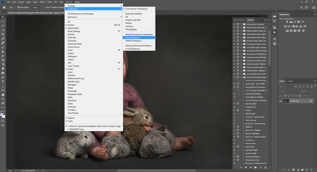
Here’s how: go to Window, then Workspace, the Keyboard Shortcuts and Menus. Here you can see a full list of your menu items, arranged in their dropdown menus. Just select any item and go to the dropdown box in the “color” column, then select the color you want. It’s as simple as that!
You can also hide tools from being visible here, and if you want them back in the future, just come back to the menu and uncheck the box.
Save it All
Once you have finished creating your custom workspace, make sure you save it as a preset. You could call it your name, or what you will use it for. Imagine the freedom of being able to cycle between sets of tools depending on what kind of work you are doing!
Let’s say that you’re not just a photographer, but you also dabble in graphic design. With these options, you can create your own interface for each set of skills, allowing you to switch between them in just one click of a button. That will definitely speed up your process.
Even if you only need one interface option, having everything right where you need it will be a massive help in your post-production workflow.
Do you have your interface set up any particular way? Let us know your tips and tricks in the comments!